Environmental Data Management Best Practices
Environmental Data Visualization
When placed on a map, environmental data can take on a whole new meaning; additional insights into the problem and potential solutions may be visualized if viewed in a spatial context. This document describes best practices for visual display and dissemination of geospatial data. This document is intended for GIS users displaying environmental data.

Overview
A well-crafted map helps the map maker tell a story about data. A well-crafted map can also help the public act. Thinking during the project planning phase about how environmental data will be displayed on a map or used for analysis will allow for the collection of more useful data and creation of more meaningful maps. When placed on a map, environmental data can take on a whole new meaning; additional insights into the problem and potential solutions may be visualized when data are viewed on a map. While maps are seemingly ubiquitous and map-based information is embedded into so many devices and applications today (think phones, car navigation devices, computers, routing applications for delivery, etc.), there is not only the geographic science behind the map, but there is also an art to creating an effective map.
Project Planning Phase
Proper planning, collection, and management allow for efficient and improved geospatial data visualization. How data are going to be visualized should be determined during the planning process, and the plan should be implemented after ensuring you have quality and consistent data.
In the project planning phase, geospatial visualization begins with the initial data collection to ensure that the project team is collecting the data they wish to visualize, consistently recording the values that will have meaning when mapped, and recording the metadata that ensure data quality and accuracy components. Project planning for creating a geospatial dissemination and visualizations should include asking the client and project team these nine basic questions:
- Who is the audience for the final map product? Is it the general public or a targeted audience of professionals? You should consider the context in which the map users will be using the product. Will it be in a public meeting? On a website or printed report? Describe in as much detail as possible whom the intended audience of the final map will be and in what context they will be using it.
- What is the point you are trying to convey with your map?
- What are the data deliverables? Is it a printed or digital (online) map? Will the raw geospatial data be available for download or only the final map product? What is the quality of the printed map or other geospatial output?
- What is the project budget for data visualization? This can determine the number of hours GIS staff put into designing the map and thereby could determine the complexity and level of detail in the final geospatial visualization. Some seemingly simple maps can take hours, days, or weeks to create if the data are not in a format conducive to GIS.
- What are the project deadlines? Are there public meeting timeframes that must be met?
- If a printed product will be developed, what is the physical size of the map product, scale, and resolution?
- Does the organization have any standards that must be met? Some organizations may have an organization standard (see Organization Standards for Geospatial Environmental Data Management subtopic sheet) for projection, scale, or geographic extents of their geospatial products.
- What is the message or feeling that you wish to convey by the map? Do you wish people to take action about a particular topic or is the map for informational or educational purposes?
- Finally, evaluate the technology needs for creating the data visualization or map product. Does your organization have the software and training required to produce such a product?
Use of GIS for Environmental Data Visualization
GIS is a great tool for visualizing, geospatial modeling, and analyzing environmental data. Organizations are encouraged to collect and manage all environmental data so that it can be used and visualized in GIS. See the Geospatial Data Software subtopic sheet for a list of potentially useful applications in support of visualization.
Raw environmental data can be modeled in GIS. A geospatial model is a digital representation of something occurring in the real world. Spatial modeling identifies the continuous spatial distribution implied by environmental data points (for example, contouring with weighted averages). Examples of modeling in GIS are water-level contours or a 3D contaminant plume. Modeling can identify dimensions and distributions by using contouring or cut and fill tools. Modeling in GIS can make predictions by running contouring, fencing, or spatially weighted average tools.
There are multiple tools for environmental data analysis in GIS. Analysis is a systematic examination of a problem or complex entity to provide new information from what is already known from the raw data. Examples of analysis in GIS include data querying, data summarizing, vectors and raster spatial analysis, spatial statistics (relationships of data, dominant direction, trends, dispersed, hot spots, etc.), and geostatistics. Relationships can be discovered by running spatial analysis tools such as proximity, neighbors, and overlays of data. Patterns can be detected in environmental data by using tools to identify hot spots, groups or clusters, and changes over time and distance.
There are many benefits to using GIS for environmental data modeling and visualization. Multiple data sources can easily be integrated in GIS. Regardless of the source of data (public or nonpublic, historic data or new), data can be brought into GIS. Spatial and nonspatial (attribute) data can be combined for new or additional insights.
Map Production
There are a few suggested steps for the production phase of making a map. If you have completed and documented the answers to the nine questions in the project planning phase, this can go a long way to making the map production phase that much easier. Here are some things to keep in mind as you enter the geospatial data dissemination and visualization or “map production” phase:
- Make sure there is a clear purpose for the map.
- Intent should be apparent.
- Map title should reflect the map intent.
- Write down the information you’re trying to convey or the argument you’re trying to make. Focus on how the map supports it.
- Considerations for visualizing geospatial data
- Recall your answer to question 8 above. Is the objective and message you want conveyed effectively?
- Build a prototype of your map or geospatial data visualization. Is the information clearly displayed and visual? Too much extraneous information can make your map appear busy and confusing.
- Does your organization have accessibility standards that must be met? Consider the following:
- Six or fewer colors on a map are easier for the brain to interpret differences.
- Consider accessibility when selecting colors and other visual representations for a map. Can different sizes and types of shapes be used to represent magnitude of a value rather than different colors? If colors must be used, has accessibility been checked? For example, there are a few reputable websites such as www.colorbrewer2.org or the accessibility tools on Adobe Color website (https://color.adobe.com/create/color-wheel). Note that use of a trade name website is not an endorsement of the product, but an example of how a popular graphics and visualization software package has free tools to help you make accessible data visualizations. You do not need an Adobe license to use the accessibility tools on their website. Additional resources for accessibility are listed at the end of this document.
- Appropriate use of plain language descriptions or text.
- Simple shapes and sizes for representing data points.
- If the map is printed in black and white, make sure the message is still represented clearly and accurately.
- Does the map or end product need a specification sheet? Specification sheets outline the end-user requirements for the map or data visualizations and include identifying user personas, requirements, accessibility limitations or constraints, and other parameters. A thorough review of creating a map specification sheet is provided in Balley et al. (2014).
- Is the information correct and has it gone through a quality assurance/quality control (QA/QC) process? (See the Geospatial Data Collection Consistency and Geospatial Data Standards subtopic sheets.)
- Ensure all regulatory requirements are met (see Organization Standards for Geospatial Environmental Data Management subtopic sheet).
- It is best practice in the map production phase to document the process used to create the data visualization, especially for difficult-to-recreate processes or destructive processes. Destructive processes within a GIS convert geospatial data from one format to another. For example, lines can be converted to polygons or text is converted to graphics. In the case of a geospatial model, some of the analytical programming code is modified or removed as part of the process.
- Determine the process you will use for version control and backup during the production phase, as well as into the final production and update phase of the project. Version control processes are recommended for not only the static map products, but also dynamic web-based map products and geospatial visualizations. (See Data Disaster Recovery Fact Sheet for further tips about version control and backup processes.)
- Prepare the data and create your final map and map files.
Final Map Product
Making a map is as much an art as it is a science. The science part of making a map has some well-established principles to create a meaningful cartographic product. Here are some cartographic principles:
- Recommended basic elements of a final map product (see Figure 1 for an example of a final map product).
- Title
- Scale (see list below about scale and resolution)
- Neat line
- North arrow (see note below about use of north arrow)
- Legend or key
- Date produced
- Organization name that created the map; include map author if that is organization’s standard practice
- Inset map, if necessary
- Notes—with sources and limitations (see Geospatial Metadata subtopic sheet)
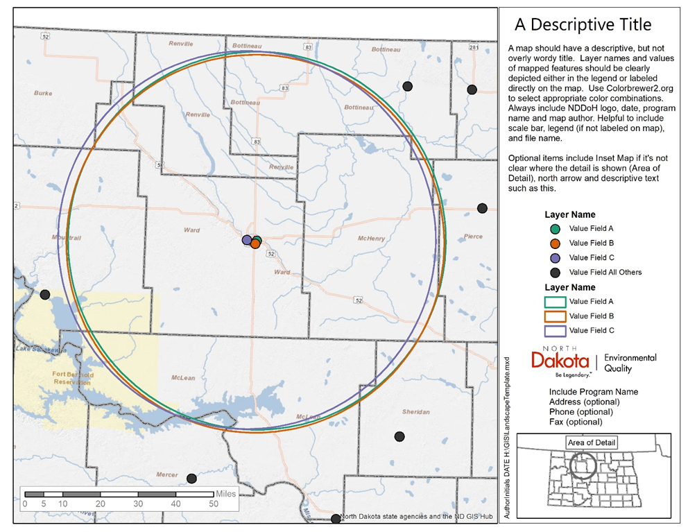
Figure 1. Example of final map product.
- Be aware of visual hierarchy of map elements. Visual hierarchy refers to the way the eye perceives the elements on the map. The eye perceives things differently if the map is on paper or an interactive web map. Even so, some elements of visual hierarchy are consistent no matter how the end product is disseminated.
- Reserve darker shades, thicker lines, and larger fonts for the most important items on the map. Think about the most important elements to convey your identified message.
- Less important items should be lighter, thinner, smaller, or more transparent.
- Use consistent styles and placement of map elements.
- Font, formatting, and other components across figures in a report should be consistent.
- Use the same symbols for the same features, and different symbols for different features.
- If more than one map figure is used on the same web page or in the same document, keep title box, north arrow, scale bar, legend, notes, and other common map elements in the same location across figures, when possible.
- Have a reason to move something, either because during user testing it did not convey the intended information or was perceived differently than the map’s original intention.
- Clear symbols
- For accessibility reasons, don’t rely on color to differentiate symbols. Try different shapes, hatch or fill patterns, size, orientation, or transparency to differentiate between data points.
- Make sure symbols are large enough for everyone to see.
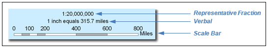
- Scale and resolution
- Scale refers to the spatial extent of an area on a map and can be represented on a map with a scale bar, verbal scale, or representative fraction. GIS software makes it easy to add these map elements. It is acceptable practice to represent scale by using more than one of these elements. For example, a scale bar may also be combined with a representative fraction, as shown in Figure 2.
- The spatial extent of the mapped area and granularity of the data are major constraints of map design (Field 2018). Use the largest scale (most zoomed in) the data allow that still delivers the message.
- Note that a verbal scale can be inaccurate when reproduced or resized. Because of that, consider adding a note on the map about the size of the printed page, such as “Intended to be printed on at 8.5 x 11-inch paper.”
- Scale bars are preferred because the bar changes in direct proportion to changes in the map if it’s reduced or enlarged on a photocopier.
- Depending on the intention of your map, you do not need to have maps to scale, but it is very important to indicate that your map is not drawn to scale!
Figure 2. Example of a scale bar combined with a representative fraction and verbal scale.
- Use of north arrows
- It’s generally accepted in the northern hemisphere that north is “up” or oriented toward the top of page. If the final publication deviates from that convention, then a north arrow should be included. If the inset map and overall map do not have the same orientation, then include north arrow(s).
Resources
- Esri cartography MOOC (massive open online course): https://www.esri.com/training/catalog/596e584bb826875993ba4ebf/cartography./
- Accessibility standards: https://mn.gov/mnit/about-mnit/accessibility/maps/

